A & W Breakfast
Campaign Design
Objective
The objective of this project is to strategically design a campaign for A & W’s breakfast that relate to male and female audiences ages 18-65. There are a selection of advertisements that are created using different software programs and colour modes. This includes bus signs, billboards, website ads, and social media banners.
Theme
A & W is striving to focus on sustainability and believe it’s imperative to grow along with evolving environmental methods. For this reason, A & W is serving eggs from hens fed a vegetarian diet without animal by-products, and Van Houtte coffee, an organic and fair-trade coffee that is made without the use of chemical fertilizers or pesticides. With these ingredients, an organic and energy boosting breakfast campaign concept was designed.
Solution
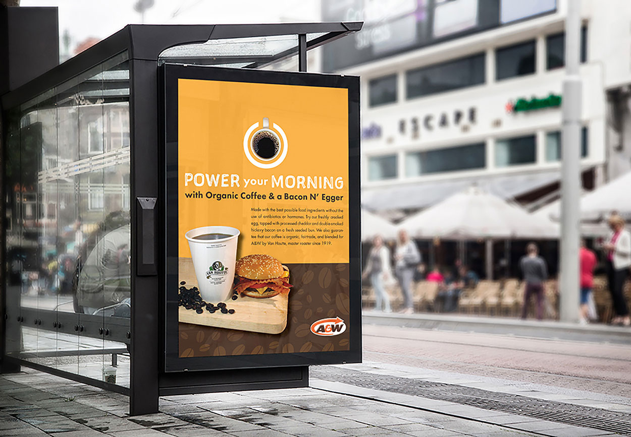
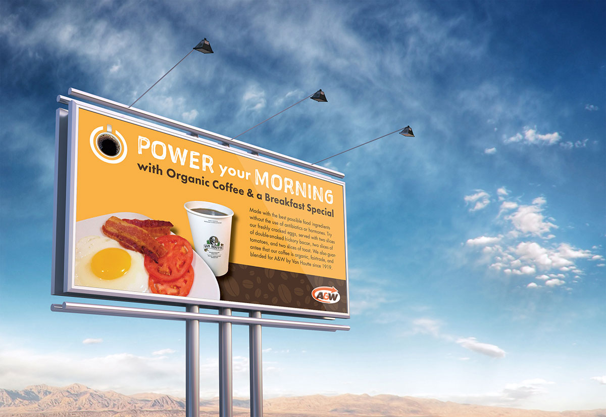
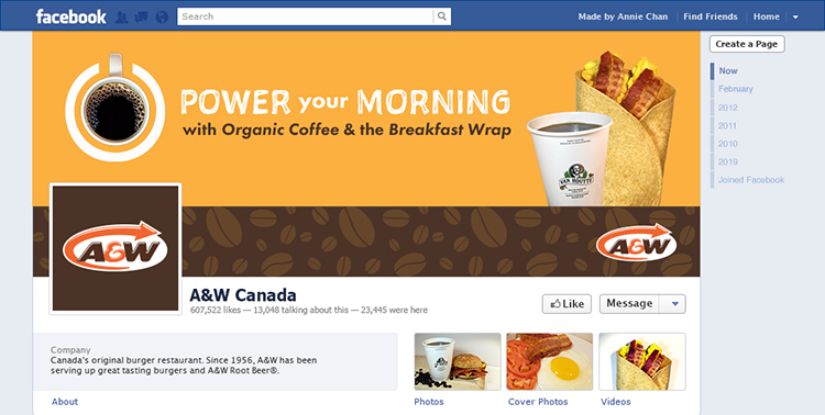
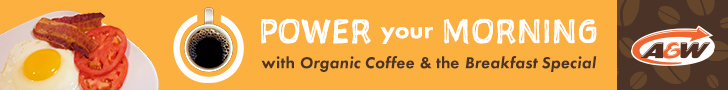
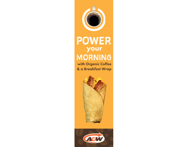
Since most people ages 18 and older drink coffee, coffee is an excellent selling point for the A & W’s breakfast campaign, which is seen in each advertisement with a different breakfast menu item.
Each ad also contains the birds-eye view of a coffee mug that is represented as a power button symbol. This symbol is the main concept of the advertisement that goes along with the slogan, “Power your morning with organic coffee and a specific breakfast item”. This play with imagery will help people remember the advertisement and it will convey the slogan’s message of how A & W’s organic coffee with breakfast will provide energy or “power” to those who consume it.
Design
This A & W breakfast campaign is created using mainly of photography and simple graphics. All the breakfast food items are photographed while the coffee bean background and the power button symbol is made in Illustrator.
Colours in this campaign consist of a brown and a yellow-orange. The brown comes from the A & W logo, which is chosen to represent a natural and earthy feel to the organic breakfast theme. While brown represents wholesomeness and earthiness, yellow-orange can represent joy and sunshine and it is also associated with healthy foods. Based on research, brown and orange are both warm colours that can stimulate the appetite. In addition, the background of the brown section of the advertisement contains coffee beans to reinforce the power symbol of the coffee mug.
Fonts consist of Sketchnote Square and Futura PT. Sketchnote Square is a handwritten sans-serif font that supports the playful and friendly breakfast theme. On the other hand, Futura PT is a bold geometric sans-serif text that is easy to read even in small font-sizes. Overall, a consistent flow is seen of the advertisements.
Facebook Timeline
Web Advertisements
Thank you for viewing