Morrison's Unisex Salon
Logo Redesign & Branding Guide
Objective
The objective of this project was to take an existing logo of a small business in Canada and redesign the logo. This was done by constructing marketing research and developing creative concepts that met the client's needs.
Research
Morrison's Unisex Hair Design and Esthetics is located on on Elgin street, which is the downtown core of Ottawa. This area is mainly considered a business area with stores, restaurants, and bars.
Due to salon's location, Morrison’s current demographic includes a mature age group of female and male adults aged 20-70. They are middle to high-class individuals who are either single or married. They all take a similar interest in beauty and fashion.
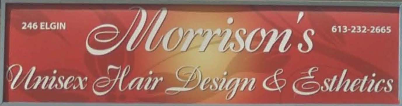
The Original Logo
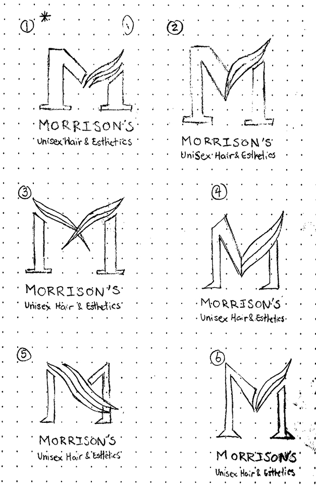
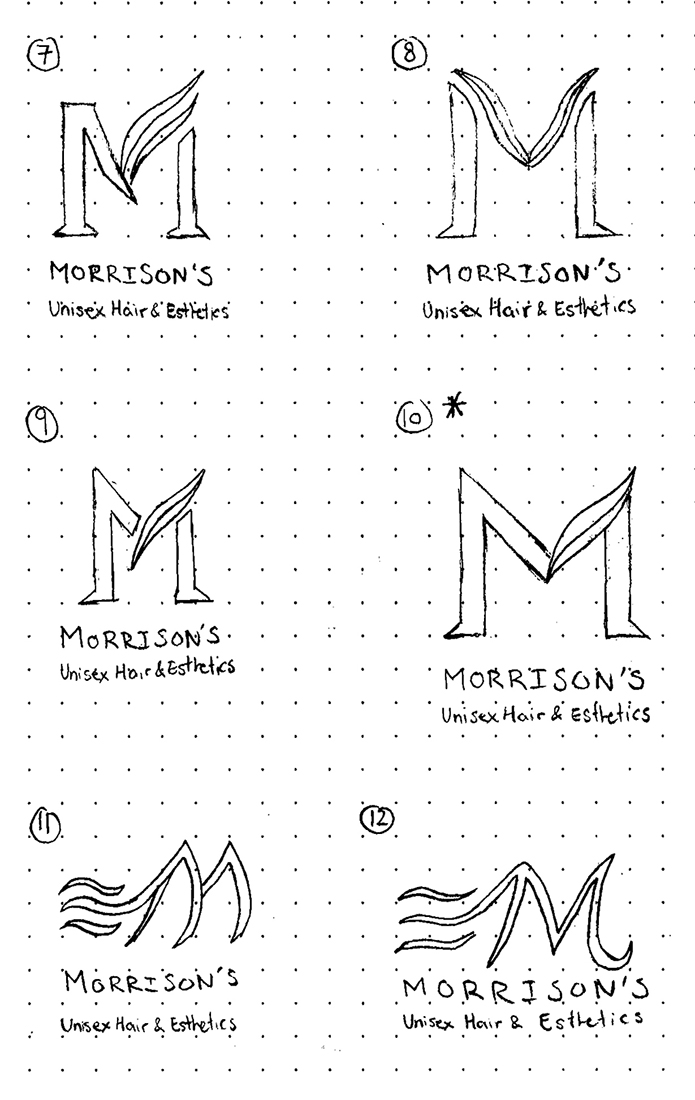
The Concept
Morrison’s want to be percieved as a luxury hair design studio and beauty salon who provide high quality and friendly service for both genders. They want their logo to be recognized by their mature demographic and also attract new customers to obtain their loyalty for future business.
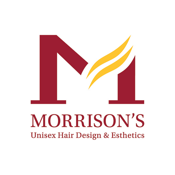
The Redesigned Logo
The logo represents the best qualities and characteristics of Morrison’s Unisex Hair Design & Esthetics identity. The logo has been created with dynamic flexibility that reflects their stylists’ ability to professionally style and treat hair.
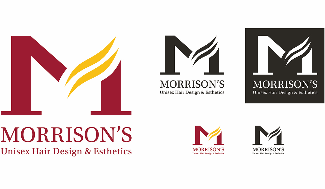
In a single glance, the logo shows the versatility of Morrison’s Unisex Hair Design and Esthetics. The concept of the logo uses the letter M in Morrison’s and incorporates two elegant, wave-like shapes in the letter, replacing the right diagonal stroke. These two shapes symbolize hair or a hairpiece that represents Morrison’s main service, which is hairstyling. The hairpiece symbol is easily understood and recognized. The bilateral serifs found at the foot of the M creates a sense of stability and reliance of the logo.
Overall, the logo elegantly works together, creating a luxurious feel to the brand.
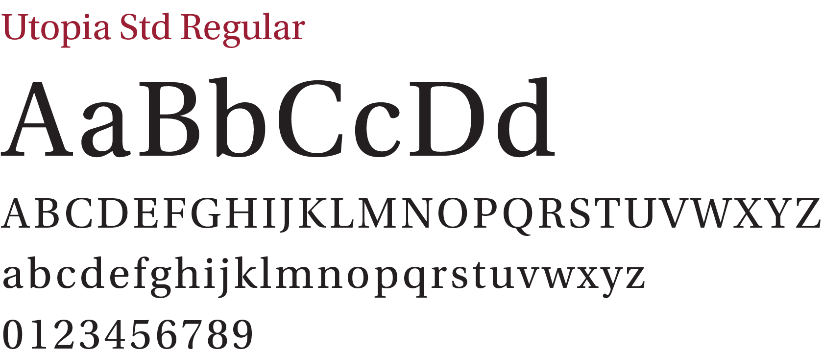
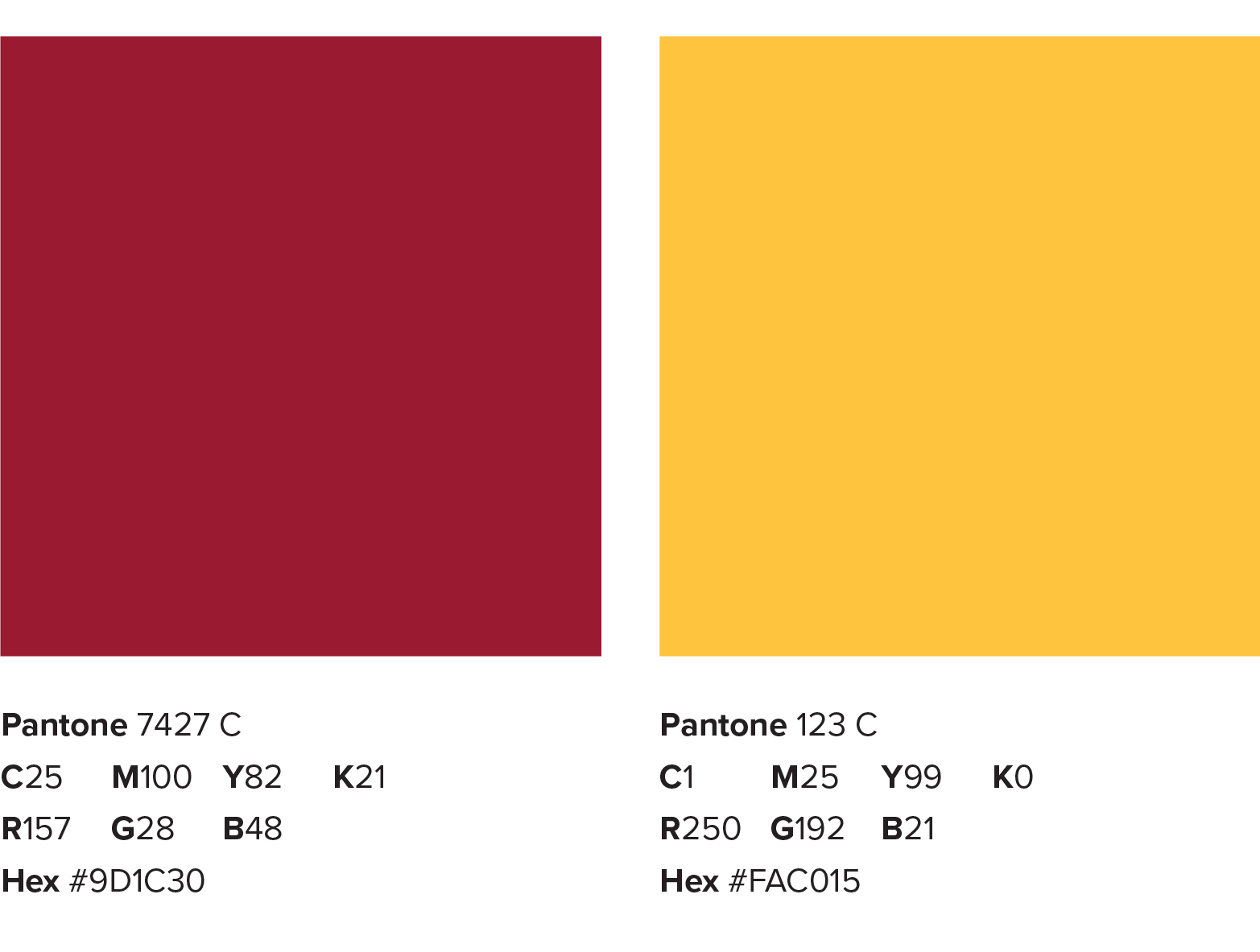
Branding Guideline
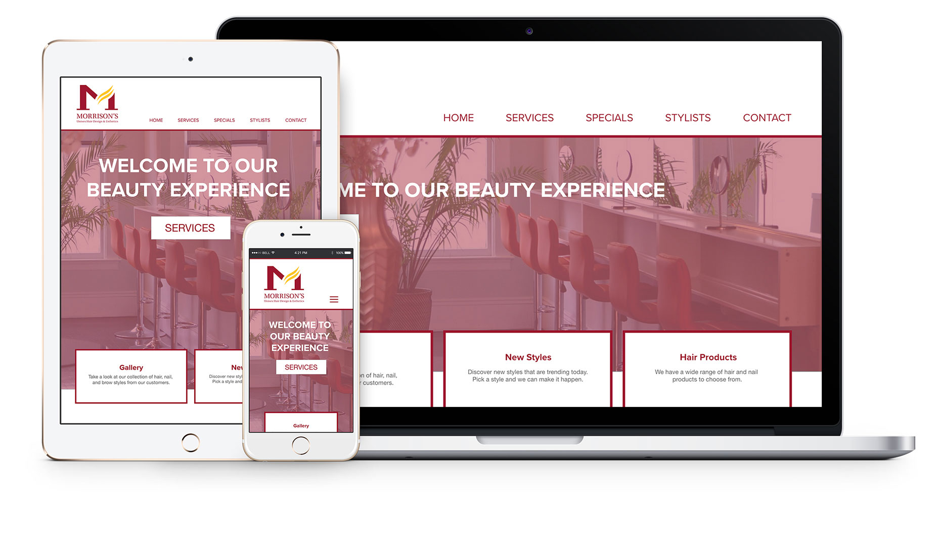
Website
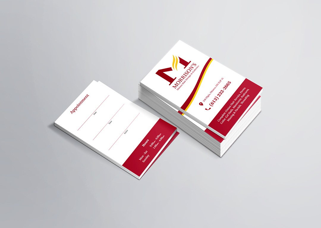
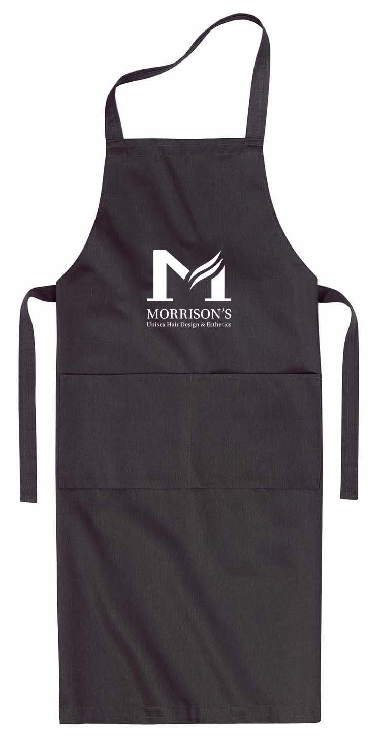
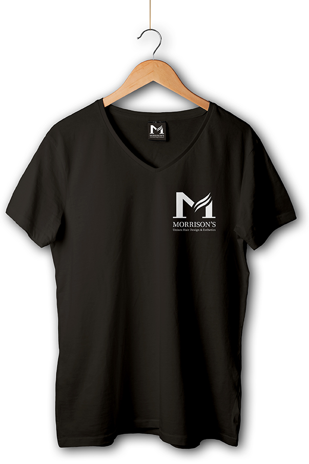
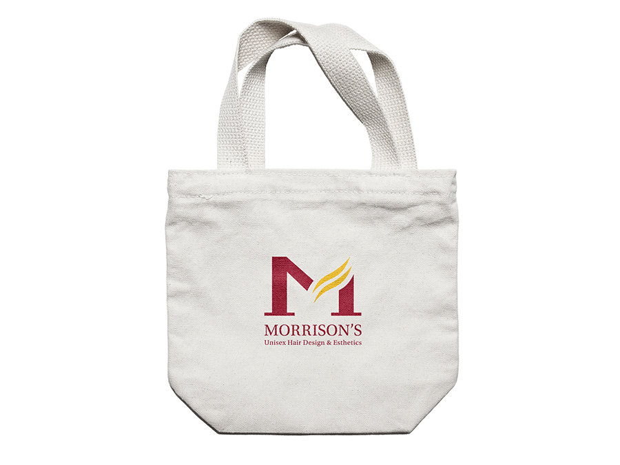
Application
Thank you for viewing