Point G
Packaging Redesign
Objective
The objective of the project is to re-design Point G’s hand packed macaron packaging that decreases the amount of packaging and change the materials used, so they are more environmentally friendly. This is also strategically and conceptually designed in order to target female audiences ages 16-30 that enjoys gourmet pastries and sweets.
Problem
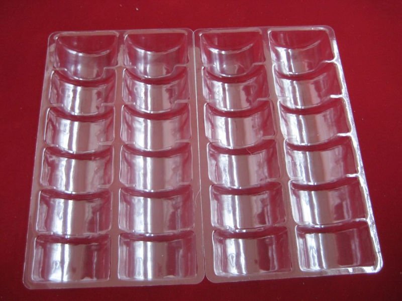
Point G is a bakery specializing in macarons, which are French pastries that are similar to small sandwich cookies. Everyday, fresh macarons are made at the store with over 15 flavours. Many customers come in to buy hand packed macarons, which allows the customers to pick the flavour they like to take home. However, the original packaging consists of plastic trays that are non-recyclable.
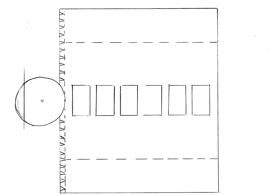
The Original Packaging
Solution
To make this more environmentally friendly, recyclable cardboard is used to make the new packaging. In addition, the design of the packaging is also changed to make the brand stand out.
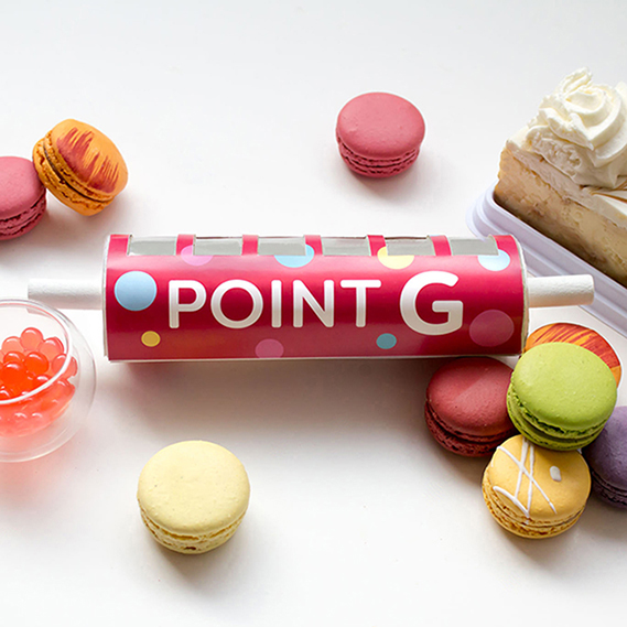
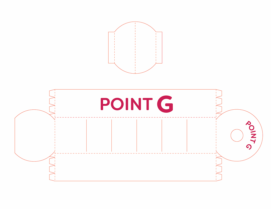
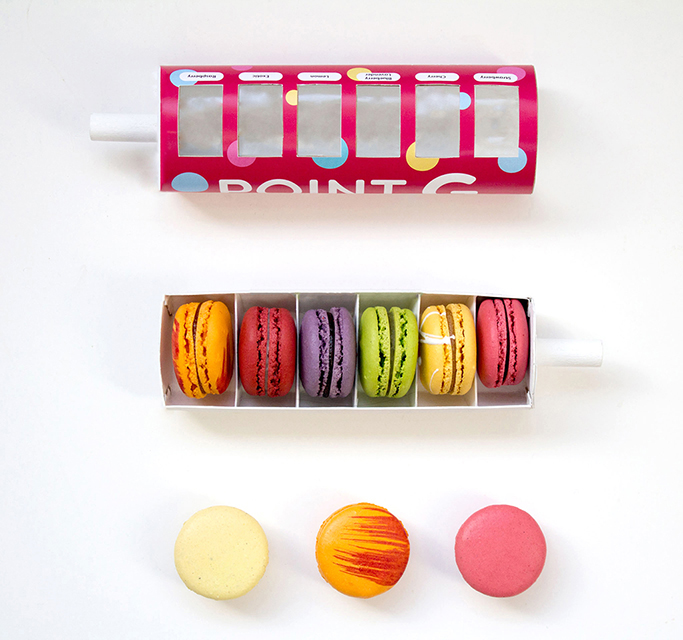
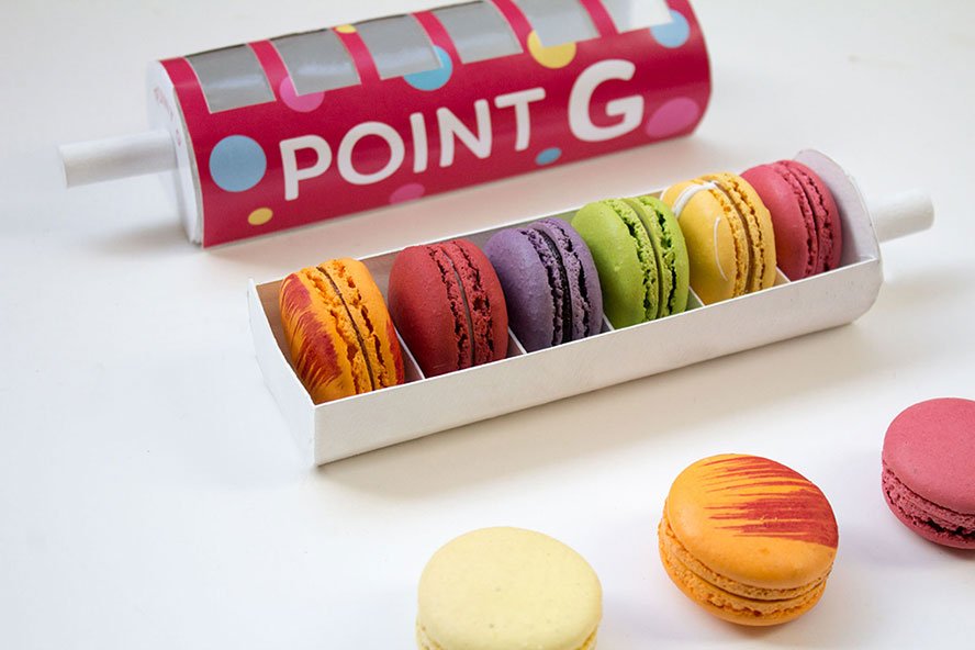
To target female audiences 16-30 who enjoys gourmet pastries and sweets, a cute and unique packaging related to baking will be successful. Thus, a rolling pin concept was inspired to make this package. The packaging is cylindrical with wooden handles on each end to replicate a rolling pin.
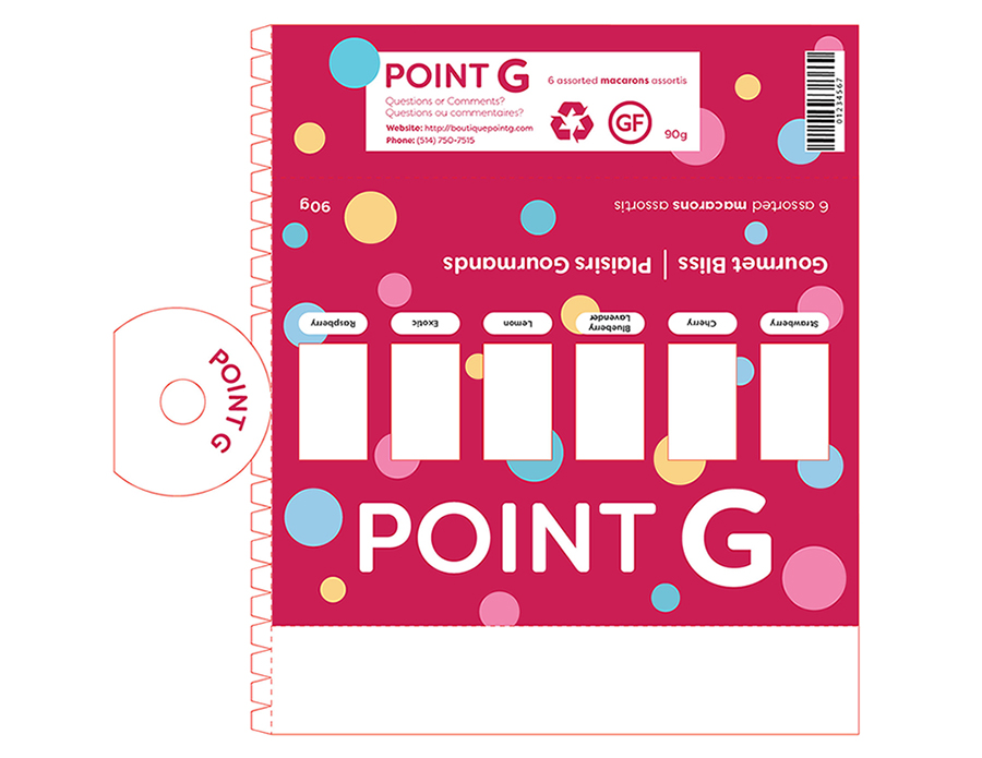
In the sleeve, there are recyclable plastic screens that allow consumers to see the macaron inside the package. Also, there are blank spaces for each screen to allow consumers to record the unique macaron flavour they have chosen. This is an important feature that many hand packed macarons do not have and it is especially useful when you are giving fresh macarons as a gift. Inside, there is a tray that is made out of cardboard with cardboard dividers.
Design
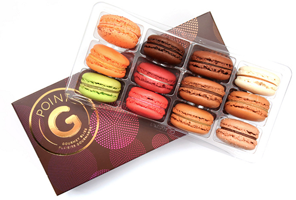
The new and improved packaging contains Point G’s alternative logo to accommodate the shape of the package. The packaging includes colourful circular graphics that represent the different macaron flavours. This makes the packaging appear cute and ‘bubbly’, which suits the theme of the brand.
Also, the prominent colour for Point G is bright pink, a suitable colour for female audiences that stand out and is recognizable. For a drastic contrast, the inside is made entirely white compared to the outside. The font used is called Filson Soft, that is chosen based on its similarity to the logo’s font. It is a cute and readable font, which ties the theme together.
Since each macaron will most likely be a different flavour, a nutrition label and ingredients list will be available to customers when they visit the website provided at the bottom on the macaron box. By doing this, paper does not have to be wasted for a full set of different macaron ingredients and customers can view more information of Point G’s pastries at any time.
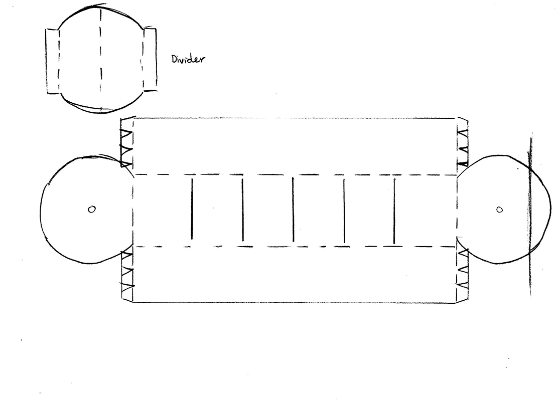
Dieline
Final Product
Thank you for viewing